That User Advocate Guy
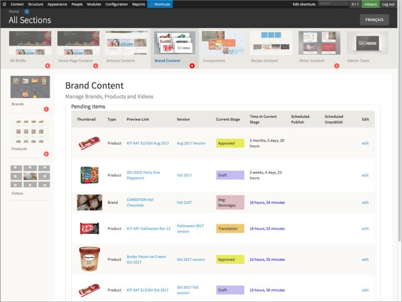
Screen shot of the enhanced UI for the State Flow Versions workflow

The Meaningful CMS

March 15 2018

Drupal's ability to scale and its overall flexibility comes largely through its depth of abstraction. While this abstraction is critical on a technical level it generally makes tasks more difficult for non-technical users. In this video Michael Keara demonstrates a meaningful CMS user interface system that he built with Drupal 7 to make the content management workflow a simple, intuitive process.

Title slide from the 2014 Drupalcamp presention

Intentional Sitebuilding

July 10 2017

My hypothesis: Drupal does not have a systematic way to build an Information Architecture that clients can understand. This can lead to significant communication challenges between client and vendor. in this video I present an Outside-In UX strategy that can potentially resolve this problem.

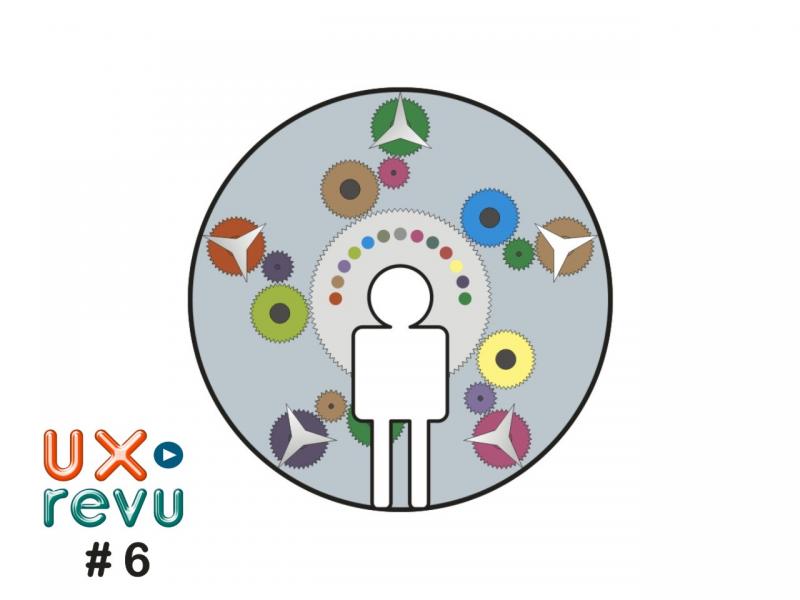
Illustration of a user in front of a symbolic machine with gears

UXrevu #6 - Simplifying for Better Engagement

October 26 2013

Membership organizations run by volunteers gain a lot of value from using a powerful commercial website management system. The shared tools bring benefits to all the individual organizations and produce better websites, economically. But where is the boundary between the shared tools and the need to individualize user engagement?

Illustration of a thundercloud over a user

UXrevu #5 - Making a Personal Home Page More Personal

October 16 2013

Part 2 of our look at usability issues that arise for our student user as she tries to find her way around a newly launched university website. We look more in depth at the specific obstacles she faced and also at another web site that she can really understand well.

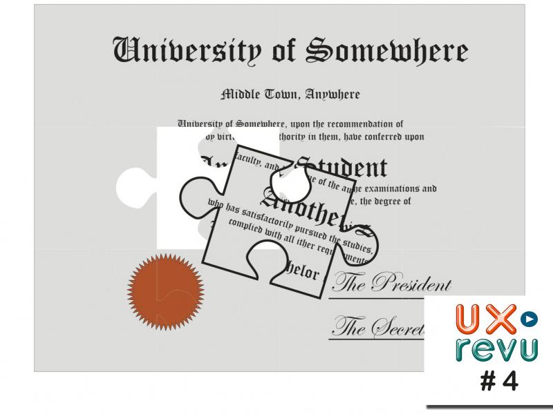
Illustration of a university degree as a jigsaw puzzle with the last piece displaced

UXrevu #4 - Thinking Outside the Inbox

October 12 2013

One student's response reveals a key flaw to sweeping changes on a university web site. The search for a new student email inbox proves to be difficult for a surprising reason.

Illustration of value as a pot of gold

UXrevu #1 - Value Oriented Design

October 1 2013

Will increased JavaScript screen interactivity really provide a better UX and help users get the value from a website? In this first edition of my UXrevu series, I examine such a site and proposes a powerful way to measure effectiveness of any website.